Executive Summary
In this week’s Update, I share important information published in an interim comment by economist Dr. John Hussman. He uses numerous market indicators to gauge market extremes, which all culminated last Friday, November 19. While claiming he is not “calling the market top,” the risk indicators reached the “motherload” level necessitating his warning comments. Take a look at the three included graphs along with the commentary to grasp the level of risk in equity markets currently. As always, thanks for reading and Happy Thanksgiving to all of our readers!
Please proceed to The Details for a complete look.
“Patience is the companion of wisdom.”
–St. Augustine
The Details
Regular readers of my Updates know that I often draw on the research provided by economist Dr. John Hussman. He writes one of the most detailed comprehensive monthly market newsletters I have read. After over 40 years researching and studying markets, he has come to identify many indicators of relationships and markers which often occur near market extremes. These indicators culminated last Friday, November 19, inspiring him to issue an interim comment in which he wrote:
“Well, on Friday, November 19, we hit the motherlode. Across four decades of work in the financial markets, and over a century of historical data, I’ve never observed as many historical indications of a market peak occurring simultaneously. Noise reduction is always a process of drawing a common signal from multiple, partially correlated sensors, even if each individual sensor might be imperfect. The reason that we follow boatloads of these syndromes is the same reason we base our gauge of market internals on thousands of securities – uniformity conveys information.
Emphatically – and this is important – my intent here is not to ‘call the top’ of this bubble. Yes, this is a bubble in my view. Yes, I believe it will end in tears. Yes, the price investors pay for a given stream of future cash flows is inseparable from the long-term returns they can expect. Yes, if this bubble is ever to actually have a top, this would be a perfectly reasonable moment to expect one. Still, my present intent is simply to share what we’re observing.”
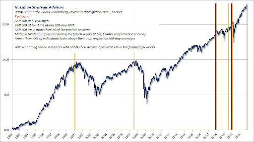
One of the syndromes Dr. Hussman identified uses a number of data points to identify an over-extended S&P 500 Index using both short-term and long-term measures. The graph below shows the occurrence of this syndrome using red bars. When the red bars are shaded with yellow, it is an indicator that the S&P 500 Index fell by at least 6% over the following 6 weeks. Again, this is not intended to be a prediction, but a historical representation of what has occurred.

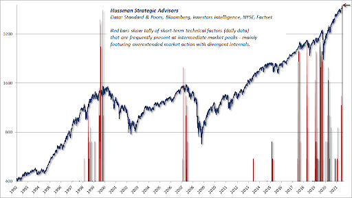
His chart below shows observations of extreme markets using daily data. The prior record was on March 27, 2000, the day after the Technology Bubble peaked. The current indicator is now higher.

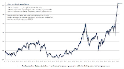
Regarding valuations, Dr. Hussman’s favored methodology which happens to be most correlated with actual subsequent returns, has gone vertical. It is quite easy to spot the severity of the market bubble in this graph.

This methodology indicates a stock market which is now 3.5 times above its long-term average. Simple math would then show a correction of over 70% is needed to bring valuations back to the long-term norm. Whenever a chart shows a vertical ascent as shown above, it almost always is followed by an equally severe descent.
The point of this newsletter is not to say this bubble can’t continue a little longer and become even more extreme. But instead, is to share Dr. Hussman’s data to provide a warning about the risk embedded in the market today. As well known investment manager Jeremy Grantham of GMO stated (via Hussman’s newsletter):
“I’ve been very clear about what I consider a definition of success – and that is only that, sooner or later, you will have made money to have sidestepped the bubble phase.”
At some point in the future, investors will again learn that the damage incurred during bear markets has a more negative impact on portfolios than the (temporary) gains achieved during market bubbles. Red flags are waving.
The S&P 500 Index closed at 4,698 up 0.3% for the week. The yield on the 10-year Treasury Note fell to 1.54%. Oil prices decreased to $76 per barrel, and the national average price of gasoline according to AAA remained at $3.41 per gallon.
Thank you for taking the time to read this week’s report. If you frequent these posts, you know that I always like to take a moment of my day to be grateful for the life I live and to think of new ways to help those around me.
With that being said, I’d like to invite you to join me in supporting St. Jude’s Children’s Research Hospital.
I am a St. Jude Hero! I have chosen to run for a reason bigger than myself by fundraising for the kids and families at St. Jude. I am training to cross the finish line on race day and with your donation we can cross the fundraising finish line together because the money you donate helps find a cure for childhood cancer.
© 2021. This material was prepared by Bob Cremerius, CPA/PFS, of Prudent Financial, and does not necessarily represent the views of other presenting parties, nor their affiliates. This information should not be construed as investment, tax or legal advice. Past performance is not indicative of future performance. An index is unmanaged and one cannot invest directly in an index. Actual results, performance or achievements may differ materially from those expressed or implied. All information is believed to be from reliable sources; however we make no representation as to its completeness or accuracy.
Securities offered through First Heartland Capital, Inc., Member FINRA & SIPC. | Advisory Services offered through First Heartland Consultants, Inc. Prudent Financial is not affiliated with First Heartland Capital, Inc.

