Executive Summary
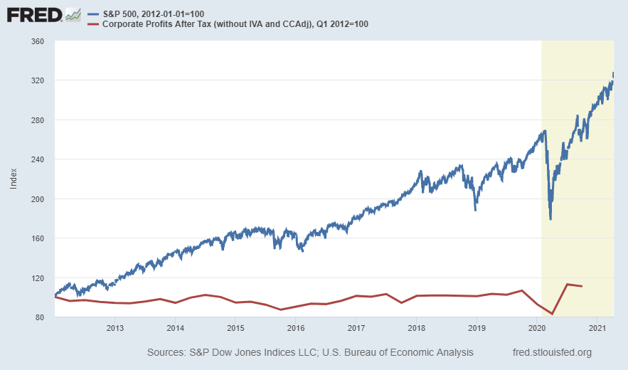
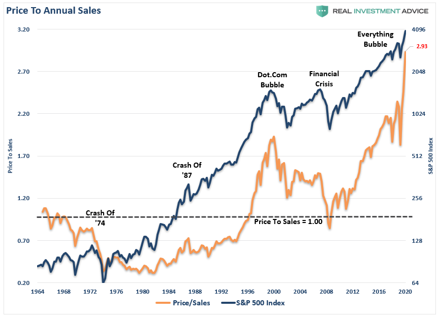
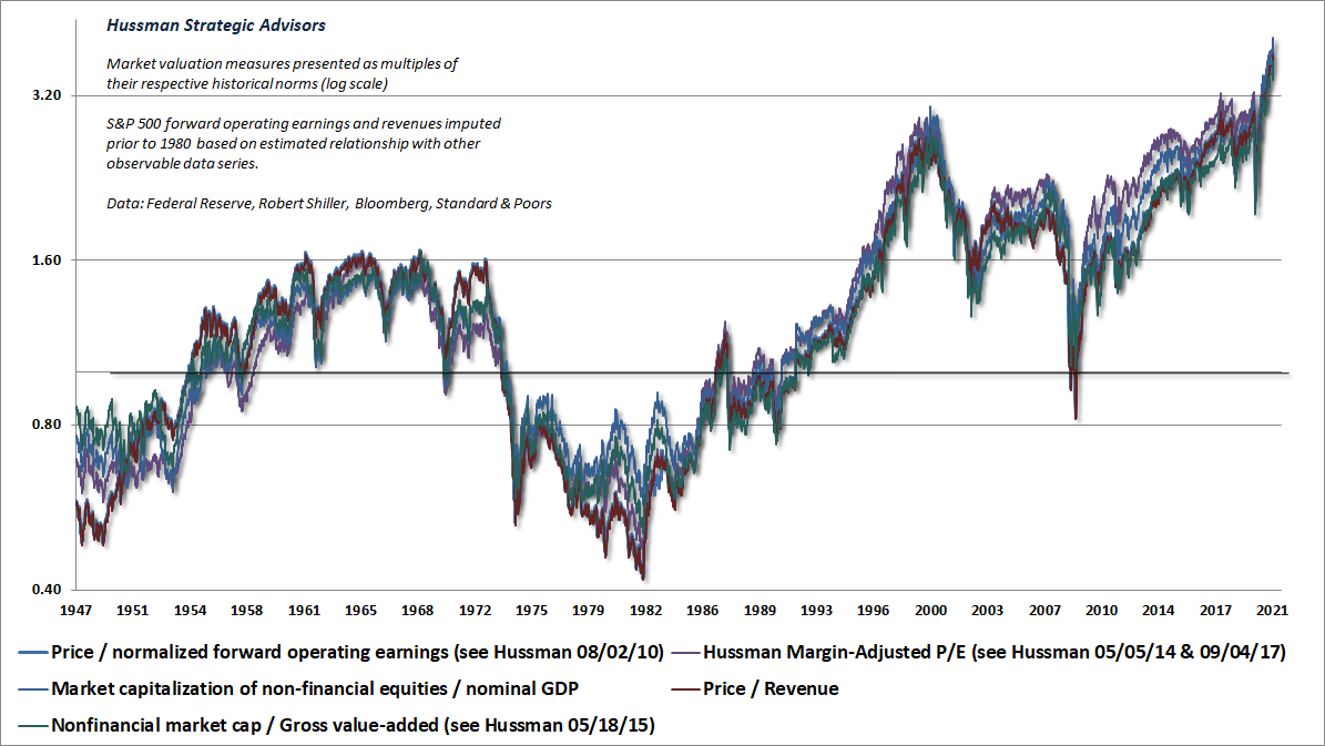
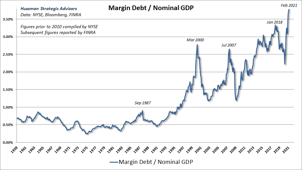
The first graph below illustrates the growth in corporate profits versus the S&P 500 Index. The point of sharing this is not to predict a stock crash, but rather to display the embedded risk in the market. Historically market cycles have consisted of both an upside and a subsequent reversion to the long-term average. The next two graphs show various market valuation methods depicting the current overvaluation. Much of the market growth since March 2020 has been fueled by margin debt (see fourth graph) and Federal Reserve Bank money printing. For current markets to fall below the long-term average, they would have to fall by over 70%. Again, this is not a prediction as to the timing of such a correction. It is shared so investors will have an understanding of the investment risks in the current markets. Market cycles always end similarly, it is too bad investor memory is so short.
Please proceed to The Details.
“Facts do not cease to exist because they are ignored.”
–Aldous Huxley
The Details
Long-time readers will recognize the graph below comparing the S&P 500 Index (blue line) with the growth in corporate profits (red line) since January 1, 2012. In a perfect world, these lines would be identical. The year 2012 was chosen as the starting point as that is when S&P 500 valuations began to get frothy. The purpose in showing this graph is to illustrate the growing overvaluation of stock prices. I am sure there are readers who will say I have been pointing out this disconnect for a very long time. My response to that would be, yes, I have. However, there could be some confusion among readers as to why I have been highlighting this for so long. The reason has not been to indicate a stock market crash or correction is imminent. The aim has been, and continues to be, to show investors the embedded risk in the market. Every stock market cycle in history has eventually seen a reversion to the mean in stock price valuations. The chart below gives some indication of how wide that wedge is.
Knowing the potential extent of future corrective movements should be part of every investor’s understanding. The exact timing of such action is another thing. When illustrating the massive disconnect and potential losses upon the next reversion, I have never stated when the correction would occur. I have merely provided the data to show what the market could look like on the other side of the reversion. For example, below is a graph from Real Investment Advice of the S&P 500 Price-to-Sales (P/S) ratio compared to the S&P 500 Index. Updated last week by economist John Hussman, the P/S ratio has climbed to 3.06 (an all-time record high). The long-term average is below 1.0, indicating prices are over 3 times the norm. But more importantly, notice the long period beginning in the late 1960’s where the level was below 1.0. The fact that this has not occurred – other than a brief blip at the 2009 market bottom – since the 1990’s, indicates it could be long overdue. Historically, when markets correct at the end of a cycle, they drop below the long-term average for some period of time. A drop below the mean would currently require the market to fall over 70%. Notice, I did not say the market is going to fall over 70% this year.
To show the above chart is not a “one-off” depiction of valuation, the following chart from Hussman, compares five separate valuation methodologies all showing record overvaluations in stock prices.
It is important to note that the jump in prices since March 2020 has been fueled by massive borrowing. The graph below shows record margin debt relative to GDP.
It is common knowledge that stock prices have risen due to an unprecedented amount of growth in the monetary base by the Federal Reserve Bank (Fed). Even so, eventually fundamentals will matter. The graph below from Hussman illustrates 10-year projected returns in various asset classes based upon historical precedent. Note the different time frames shown and that the “current” line has a “Correlation of projected total return estimates with actual subsequent returns since 1950: 0.89 or higher.” In English, this means the projection is based upon a reliable methodology. Notice for every asset class (except Utilities), the “current” line below is near or below every previous bear market cycle illustrated. The projection for the S&P 500 Index is for an average annual loss of around 5% for the next 10 years. Of course, markets do not move in straight lines. More than likely there will be a large correction and then bouncing back and forth with the net result being an annual loss of 5% per year for 10 years. This is based upon a study of history.
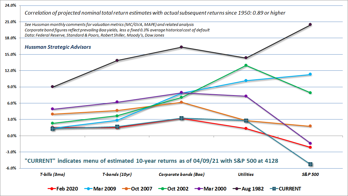
Extreme stock market bubbles tend to affect one’s thinking about the future. Investors like to pretend the current bubble will end differently than every previous bubble. As Hussman stated in his Market Comment, “In every speculative episode, the mere concept of ‘market history’ is viewed with derision.”
In the first graph above, the wedge continues to widen. One would hope the two lines were perfectly correlated. Instead, it would take of correction in prices of nearly 70% just to bring prices back to long-term norms. Note, I did not say prices are getting ready to crash 70%. I am merely providing the data so once the cycle is complete, it will not be stated that I never highlighted the extent of market overvaluation.
The S&P 500 Index closed at 4,129, up 2.7% for the week. The yield on the 10-year Treasury Note fell to 1.67%. Oil prices decreased to $59 per barrel, and the national average price of gasoline according to AAA fell to $2.86 per gallon.
© 2021. This material was prepared by Bob Cremerius, CPA/PFS, of Prudent Financial, and does not necessarily represent the views of other presenting parties, nor their affiliates. This information should not be construed as investment, tax or legal advice. Past performance is not indicative of future performance. An index is unmanaged and one cannot invest directly in an index. Actual results, performance or achievements may differ materially from those expressed or implied. All information is believed to be from reliable sources; however we make no representation as to its completeness or accuracy.
Securities offered through First Heartland Capital, Inc., Member FINRA & SIPC. | Advisory Services offered through First Heartland Consultants, Inc. Prudent Financial is not affiliated with First Heartland Capital, Inc.

