Executive Summary
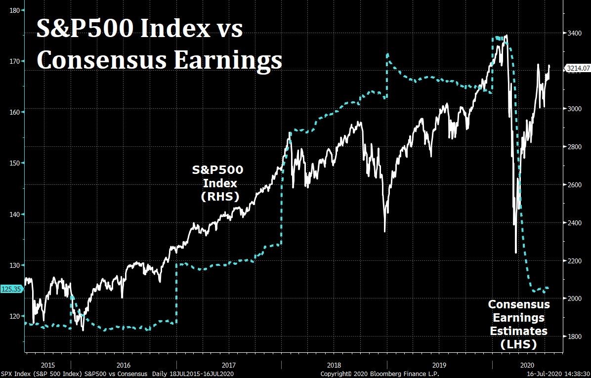
Today’s stock prices are anything but reasonable, and the warning signs extend beyond stock prices. One would think with bankruptcies escalating, debt loads compounding, profits plunging, and the dollar losing value, the stock market would be falling. But thanks to the Fed’s electronic printing press and many speculators at the party, stock prices seem oblivious to the real world. The first graph below shows the glaring disconnect between consensus corporate earnings estimates and the S&P 500 Index price. Most techniques employed to determine reasonable prices for stocks involve the use of some derivation of the Price-to-Earnings (P/E) ratio. In The Details below, one will see on multiple metrics (as shown on three graphs), stock market prices are reaching highs not seen since the Technology Bubble. The final graph shows how stock valuations impact long-term returns.
Please proceed to The Details to understand what happens when the party is over.
“If getting drunk was how people forgot they were mortal, then hangovers were how they remembered.”
–Matt Haig, The Humans
The Details
It is important for investors to understand that if they purchase any domestic broad-market equity index funds today, they are not “investing.” That is at least in the historical sense of the word where one associates “investing” with purchasing stocks at reasonable prices based upon expected future cash flows. Today’s stock prices are anything but reasonable. And, the warning signs extend beyond stock prices. The expected fiscal deficit as a percentage of GDP is approaching 20%, only exceeded one time previously – during World War II. The Federal Reserve Bank (Fed) has painted themselves into a corner. The Fed will not be able to raise short-term interest rates in the future, and debt-weakened economic growth will hold down long-term rates.
As a result, the yield on the 10-year Treasury Note is hovering around 0.60% before inflation. Of course, after inflation, the real yield is negative. With debt soaring and real rates in negative territory, the dollar has been falling and gold skyrocketing. The Coronavirus seems relentless, and any thoughts of “returning to normal” anytime soon are diminishing. The economic strains are compounding as the first round of government “stimulus” funds have almost run their course. Round two is being debated now, and the final package will likely add between $1 and $3 trillion to our Federal debt. On a side note, does anyone remember when the thought of $1 trillion seemed like a fantasy? The next word we will have to learn is quadrillion.
One would think with bankruptcies escalating, as shown in last week’s missive, debt loads compounding, profits plunging, and the dollar losing value, that the stock market would be falling. But thanks to the Fed’s electronic printing press and many speculators at the party, stock prices seem oblivious to the real world. We are at the start of second quarter earnings reporting season, and the same game is being played as in previous quarters. It is astounding to see the companies that are being reported by financial media as having “strong” earnings because they were able to beat Wall Street’s drastically lowered expectations. I have reviewed companies with earnings down 50% or more year-over-year that are being celebrated. This celebration results in their stock prices rising, resulting in an unthinkable chasm.
The chart below uses Wall Street’s overblown “consensus” earnings expectations. Even so, the disconnect is glaring.
Most techniques employed to determine reasonable prices for stocks involve the use of some derivation of the Price-to-Earnings (P/E) ratio. Let’s review some results. The current P/E for the S&P 500 Index utilizing trailing twelve months earnings is about 28, the highest on record outside of the Technology Bubble. The CAPE – Cyclically Adjusted P/E – (sometimes called the Shiller P/E) attempts to smooth out fluctuations in the business cycle by averaging 10 years’ worth of earnings in the denominator. The CAPE is just over 30, very close to its highest outside of the Technology Bubble.
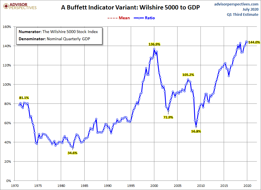
Warren Buffett likes to use the Price-to-GDP methodology in determining valuation. The chart below shows the most overvalued level on record.
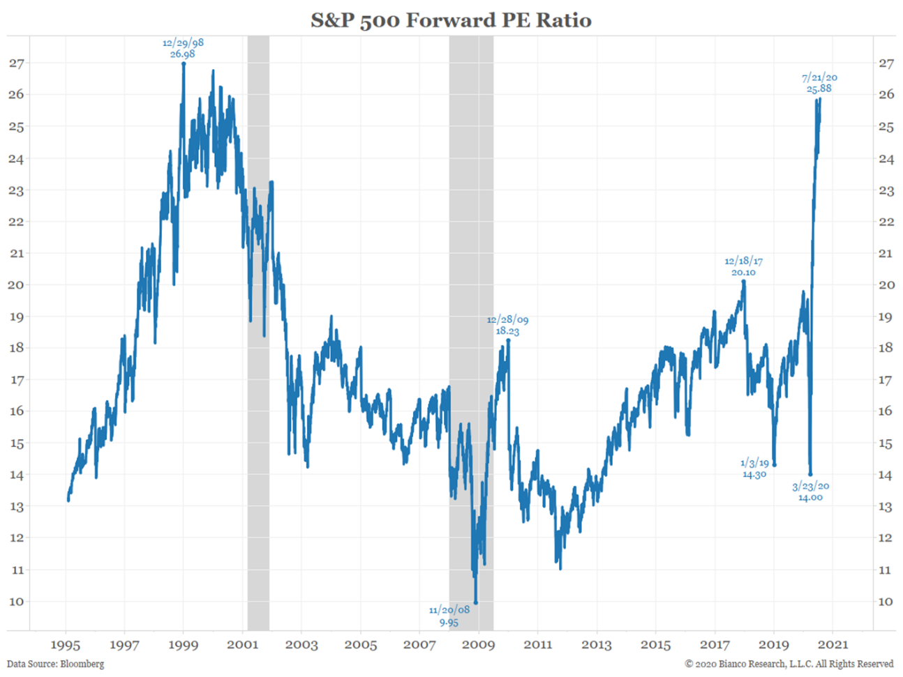
One of Wall Street’s favorite tricks to make prices appear reasonable is to use the Forward P/E or Price-to-Expected earnings. The reason I say “tricks” is forward earnings are almost always overstated, therefore; making the P/E seem lower than it should be. However, even the Forward P/E below is near all-time highs – showing massive overvaluation.
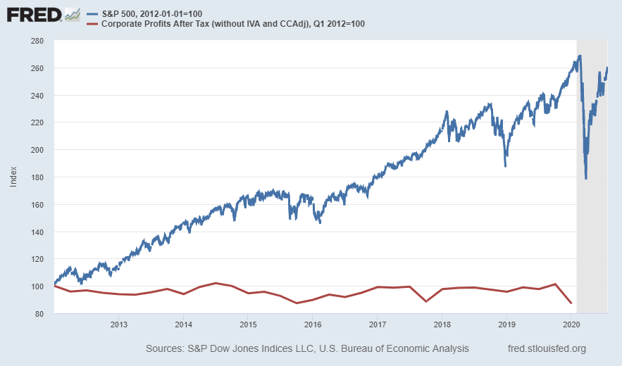
The graph below clearly illustrates the building of the largest bubble in history beginning in 2012, with corporate profits relatively flat as the market skyrockets. And, this chart doesn’t even include the incredible plunge in profits during 2020.
Although investing in bubble markets might seem thrilling as short-term profits can grow quickly, most investors do not understand that they are “renting” those profits. More than likely most, if not all, of their speculative gains will eventually disappear. The graph below does a good job of showing long-term results based upon actual historical data.
The blue line in the graph represents the 20-year annualized return for the S&P 500 (right-hand-side). The orange line, for the same time-period on the graph, displays what the CAPE (left -hand-side) was at the start of that 20-year period. For example, at the end of 2019 the S&P 500 had returned an average of about 6% for the prior 20-years. The CAPE at the start of that period was just over 40 (this was near the peak of the Technology Bubble). Notice in the graph, the times when the 20-year returns were the highest (blue line), the orange line (CAPE valuation) was near the lows.
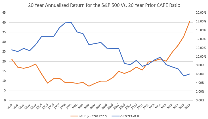
The above chart shows with historical data that the valuation of the market at the start of a long-term period is a determining factor in the long-term results. Currently, the CAPE is 30.2. Note, the last time prior to the Technology Bubble when the CAPE was over 30 was in 1929 and is not pictured on the graph. However, everyone knows what subsequently occurred.
The Fed is going all-out to let the good times roll. They are printing money with reckless abandon. The bond, gold, and dollar markets are not buying it. Stocks will buy it for a while. The longer the party lasts – the more disconnected stocks become – the worse the subsequent hangover.
The S&P 500 Index closed at 3,216 down 0.3% for the week. The yield on the 10-year Treasury Note fell to 0.59%. Oil prices remained at $41 per barrel, and the national average price of gasoline according to AAA dropped to $2.18 per gallon.
© 2020. This material was prepared by Bob Cremerius, CPA/PFS, of Prudent Financial, and does not necessarily represent the views of other presenting parties, nor their affiliates. This information should not be construed as investment, tax or legal advice. Past performance is not indicative of future performance. An index is unmanaged and one cannot invest directly in an index. Actual results, performance or achievements may differ materially from those expressed or implied. All information is believed to be from reliable sources; however we make no representation as to its completeness or accuracy.
Securities offered through First Heartland Capital, Inc., Member FINRA & SIPC. | Advisory Services offered through First Heartland Consultants, Inc. Prudent Financial is not affiliated with First Heartland Capital, Inc.

