Executive Summary
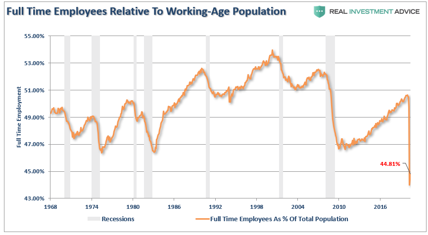
Last Friday the stock market soared upon the release of a “stunning” May jobs report. The “gain” of roughly 2.5 million jobs versus the estimated 7.5 million job losses resulted in an unemployment rate of “only” 13.3%. However, the report included a mistake! The Bureau of Labor Statistics knew they made a mistake, described the mistake in the report, but for apparent dubious reasons refused to correct the mistake. And, the stock market overlooked the mistake! A good indicator of the strength in the job market is to look at the number of full-time jobs compared to the working-age population. The current ratio is 44.81%, which is by far the lowest point since 1968. Another contributor to the “strong” jobs report was the Paycheck Protection Program in the CARES Act. Under this program, employers were required to re-hire employees who were let go in order to qualify for the “forgiveness” stipulation. More specifics are provided in The Details. Also, the National Bureau of Economic Research, the official arbiter for dating recessions, stated Monday that the U.S. officially entered a recession in February of this year.
Please proceed to The Details to better understand how “the devil is in the details.”
“Pure mathematics is, in its way, the poetry of logical ideas.”
— Albert Einstein
The Details
If you heard the stock market soared last Friday upon the release of a “stunning” May jobs report, raise your hand. According to media reports and the reaction by the stock market, it appears the “gain” of roughly 2.5 million jobs, versus the estimated 7.5 million job losses – note this is a 10 million job spread to estimates – means the economy is out of the woods. The unemployment rate fell to “only” 13.3%. If you saw the “misclassified” job classifications described in the report by the Bureau of Labor Statistics (BLS) which would have raised the unemployment rate to about 16.1%, raise your hand. One more time, if you heard a detailed explanation of job retention and/or re-hires required to be eligible for the CARES Act, Paycheck Protection Program (PPP) loan forgiveness stipulation, raise your hand. You see, the devil is in the details. But, no one seems concerned with the details, because the soundbites make people feel better.
The following is from the BLS report:
“There were also a large number of workers who were classified as employed but absent from work. As was the case in March and April, household survey interviewers were instructed to classify employed persons absent from work due to coronavirus-related business closures as unemployed on temporary layoff.
However, not all such workers were so classified.
If the workers who were recorded as employed but absent from work…had been classified as unemployed on temporary layoff, the overall unemployment rate would have been about 3 percentage points higher than reported (on a not seasonally adjusted basis).”
Here is what economist John Hussman said about this situation:
“In the Household Survey [included in the BLS report], which is used to calculate the unemployment rate, the Labor Department admitted that survey takers mistakenly counted 4.9 million furloughed workers as employed, but did not correct the data, ostensibly ‘to avoid the appearance of political manipulation.’”
In other words, the BLS knew they made a mistake, described their mistake in the report, but for apparent dubious reasons refused to correct the mistake. And, the stock market overlooked this mistake. Does that make sense?
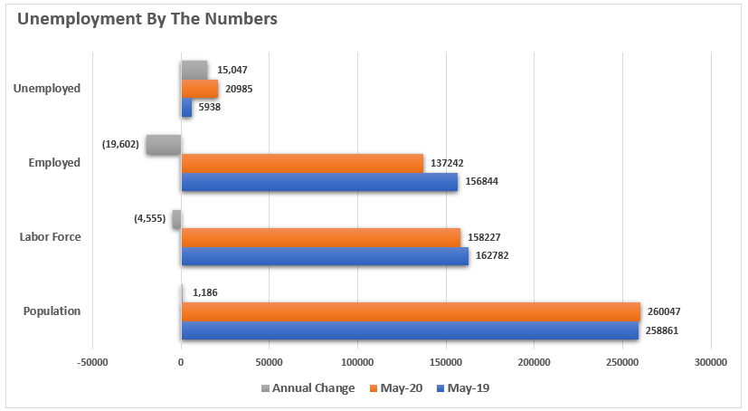
The chart below was prepared by economist Lance Roberts of Real Investment Advice and shows the jobs numbers for May 2020 versus May 2019 and the annual change.

Lance stated: “From May 2019 to May 2020:
- The civilian population grew by just 1.186 million. (This is a historically slow growth rate for the population which speaks to the demographic problem.)
- The labor force shrank by 4.555 million. (We assume these people no longer want to work.)
- The number of employed individuals fell by 19.602 million.
- The number of unemployed persons rose by 15,047 million.
Again, these are numbers never before seen in history.”
Factoring in the BLS “misclassification,” the number of unemployed is closer to 26 million.
A good indicator of the strength of the job market is to look at the number of full-time jobs compared to the working-age population. Notice in the graph below, prepared by Lance Roberts, the current level of 44.81% is by far the lowest point since 1968.

The important piece of information missing from most discussions of the “strong” jobs report relates to the requirement of the PPP program to use the vast majority of the funds for payroll expenses. The CARES Act appropriated $349 billion for loans to small businesses. The enticing part of the loan is that it is forgivable if predominantly used for payroll expenses. This forgiveness effectively turns a loan into a grant. Therefore, to ensure they meet this stipulation, businesses had to “re-hire” any employees let go and pay them whether or not they are actually working. This process, in addition to the BLS’ misclassification, contributes largely to the “stunning” monthly addition of employees. Yet, the adjusted unemployment rate remains a whopping 16.1%.
As stated by John Hussman,
“Still, Wall Street was shocked and exuberant that reported employment bounced back by 2.5 million, evidently not giving a moment’s thought of what has financed this rebound, nor the fact that this support is impermanent. What we are observing is not ‘recovery,’ it’s the impact of a government program that is paying the salaries of employees that are kept on payroll, whether they are actually working or not.”
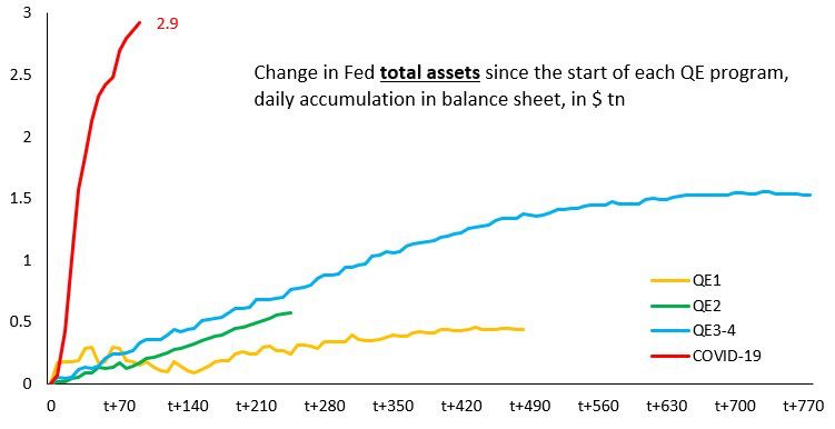
FOMO (fear of missing out) is strong, despite the weakening underlying data. The National Bureau of Economic Research (NBER), the official arbiter for dating recessions, stated today (Monday) that the U.S. officially entered a recession in February of this year. The Federal Reserve Bank (Fed) has gone to dangerous extremes to obscure the downturn. Unfortunately, what many don’t realize is whenever the Fed creates money it is for the purposes of either creating new debt or purchasing existing debt. Neither of which is a viable solution for a debt problem.
For those who enjoy pictures, the following graph compares the current Fed money creation (shown in red) compared to the unprecedented extremes enacted through various QE programs during and after the Financial Crisis. There is no comparison.

As the stock market soars on misleading employment data and the Fed does all it can to create FOMO, remember the underlying data is of the type comparable to the largest bubbles and the worst economic data in history. Said differently, the devil is in the details, and the details are concerning to say the least.
The S&P 500 Index closed at 3,194 up 4.9% for the week. The yield on the 10-year Treasury Note rose to 0.91%. Oil prices increased to $40 per barrel, and the national average price of gasoline according to AAA rose to $2.02 per gallon.
© 2020. This material was prepared by Bob Cremerius, CPA/PFS, of Prudent Financial, and does not necessarily represent the views of other presenting parties, nor their affiliates. This information should not be construed as investment, tax or legal advice. Past performance is not indicative of future performance. An index is unmanaged and one cannot invest directly in an index. Actual results, performance or achievements may differ materially from those expressed or implied. All information is believed to be from reliable sources; however we make no representation as to its completeness or accuracy.
Securities offered through First Heartland Capital, Inc., Member FINRA & SIPC. | Advisory Services offered through First Heartland Consultants, Inc. Prudent Financial is not affiliated with First Heartland Capital, Inc.

