
Executive Summary
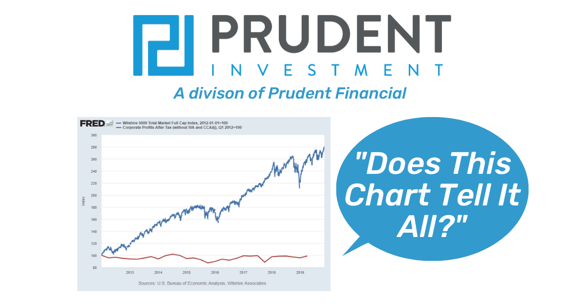
When someone buys stock, they are buying future corporate earnings. When prices rise, that should mean corporate profits have risen. The first chart below is a must see. This demonstrates the rising price without the corresponding rising profit, also known as multiple expansion. Historically, when prices disconnect from fundamental earnings, there has been a reconnection. Meaning either prices have fallen, or profits have risen. The graph of the Margin Adjusted P/E is included below as a reliable indicator of stock valuation. At this late stage of the market cycle, it is unlikely that corporate profit increases will be the cause of the reconnection. Please proceed to The Details for the “tell all”.
“How is it possible to expect that mankind will take advice when they will not so much as take warning.”
— Jonathan Swift
The Details
It seems the higher the stock market rises, the less investors care about underlying fundamentals. It is not unusual to have a conversation with an investor where after spending 30 minutes explaining the disconnect between earnings, economic growth and stock prices, the investor retorts at the end of the conversation: “but the stock market is up.” Of course, the reply to that statement, which no one listens to at irrational bubble peaks, can be stated in one word, “temporarily.” Because those who study history know, although new techniques are implemented in each market cycle to prop-up bubbles, they have always ended with major disappointment.
I have written in many newsletters, the causes of this cycle’s detachment from fundamentals rests with experimental monetary policy by the Fed, spurring a slew of corporations to execute leveraged stock buybacks, along with general end-of-cycle euphoria. In this missive I would like to highlight the extent of the “disconnect” that few seem concerned about until it is too late.
This cycle’s stock market movement, from January 1, 2012 forward, can be defined as broad-based multiple expansion. In other words, investors continually paid more for the same amount of corporate earnings. The following chart, prepared with data from the St. Louis Fed FRED database, pretty much sums up the current situation. In this graph, the blue line represents the Wilshire 5,000 Index or the stock price of 5,000 companies. This index represents one of the broadest categories of the “stock market.” The red line represents corporate profits for U.S. companies.

Many investors might look at this chart and think, “but the market is up.” And, that is exactly the point of the graph. The market is up hugely since January 2012 without a corresponding increase in corporate earnings. Why investors believe this type of move is sustainable is beyond me. At this late stage in the economic cycle, the “reconnection” of markets and fundamentals will not come from a surge in corporate profits, but instead from a plunge in stock prices back to reality.
The term “multiple expansion” refers to the increase in the price-to-earnings (P/E) ratio due to a disproportionate increase in price versus earnings. The P/E ratio of the S&P 500 Index is calculated by dividing the price of the index by the earnings-per-share of the companies in the index. A more useful derivation of the S&P 500 P/E ratio is the Shiller P/E or CAPE (Cyclically Adjusted P/E). This modified P/E uses 10-year inflation adjusted average earnings instead of prior 12-month earnings in order to eliminate the impact of the business cycle. The Shiller P/E ratio has averaged about 16.5 over the long-term. On January 1, 2012, the Shiller P/E ratio was 21.2 or 28% above the long-term average. At that time market prices were beginning to get frothy. With the help of central banks and corporate stock buybacks, the current Shiller P/E is 30.5 or 85% above the mean.
An even more accurate variation of the Shiller P/E is the Margin Adjusted P/E (or MAPE) where the Shiller P/E is adjusted for variations in profit margins. Created by economist John Hussman, this P/E is most correlated with subsequent 12-year S&P 500 returns. On this basis the stock market is more overvalued than any point in history. As a result, a correction of nearly 60% would be required to bring prices back to average valuation levels.

Injecting nearly $3.7 trillion in liquidity into the financial system and lowering short-term interest rates to near zero percent produced the expected result…massive debt balances everywhere. The Federal Government just surpassed $23 trillion in debt, while corporations and individuals have also achieved peak debt. And, with this massive surge in debt and liquidity, the economy continues to progress at a lackluster real growth rate of 2% or less

To get a reconnection to fundamentals through a jump in corporate profits to levels justifying current prices would require the economy to be “early-cycle” and debt levels to be low. An end-of-cycle economy with peak debt everywhere (including globally) is not an environment that could produce such a result.
Those wanting to continue flirting with stocks priced over double that which can be justified by earnings and economic growth should understand the “reconnection” in fundamentals will eliminate years of market multiple expansion. In fact, if the completion of this market cycle is similar to prior cycle closures, all gains in the first chart above will be wiped-out. Those choosing to ride-out this cycle until the end might want to consider that doing so allowed one to “rent” returns for the past eight years. This is not an opinion, but merely an analysis based upon all historical market cycles.
In order to reinforce the concept of extreme multiple expansion, I will be including the first chart above at the end of all future Updates until the end of this market cycle. In this way, investors choosing to remain in the stock market will be able to visually see that stock prices are trading on speculation versus earnings, and that current prices make no sense from a fundamental standpoint.
Would you pay over double the value for any other item? Probably not, yet investors today don’t hesitate to pay for stocks priced over double their fundamental value. Investment memory is short, and once in a while it takes the end of a cycle to refresh that memory. The chart above provides a clear warning.
The S&P 500 Index closed at 3,093 up 0.85% for the week. The yield on the 10-year Treasury rose to 1.87%. Oil prices remained at $57 per barrel, and the national average price of gasoline according to AAA rose to $2.62 per gallon.
© 2019. This material was prepared by Bob Cremerius, CPA/PFS, of Cremerius Wealth Management, and does not necessarily represent the views of other presenting parties, nor their affiliates. This information should not be construed as investment, tax or legal advice. Past performance is not indicative of future performance. An index is unmanaged and one cannot invest directly in an index. Actual results, performance or achievements may differ materially from those expressed or implied. All information is believed to be from reliable sources; however we make no representation as to its completeness or accuracy.
Securities offered through First Heartland Capital, Inc., Member FINRA & SIPC. | Advisory Services offered through First Heartland Consultants, Inc. Cremerius Wealth Management is not affiliated with First Heartland Capital, Inc.
Want to learn more about our Insurance strategies?
Set up a time to chat with us.