Executive Summary
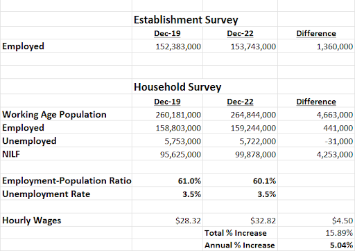
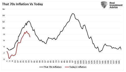
The December Job’s Report released last Friday provided optimism that inflation is slowing enough to push the FED to “pivot.” Private sector hourly wage inflation slowed to 0.3%. However, it is the apparent strength of the employment situation which astonishes pundits. Key employment datapoints comparing the Establishment Survey and Household Survey numbers are shown in the second graph below (notice the disparities). The working age population grew by about 4.7 million over the past three years, yet only 0.4 million of those became employed. The remaining 4.3 million reside in the NILF category (not in the labor force) and are not considered unemployed. So, with a tight labor market, the possibility of continued upward wage pressure exists. Looking back on the 1970’s (third graph) shows inflation reduction looked more like a ten-year roller-coaster ride. It appears time and more data may be needed to reveal the correct employment situation.
Please continue to The Details for more of my analysis.
“True genius resides in the capacity for evaluation of uncertain, hazardous, and conflicting information.”
–Winston Churchill
The Details
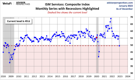
Last Thursday the S&P 500 dropped a little over 1%. On Friday, the market bounced back, jumping over 2%. Was there any specific reason for Friday’s leap? It is almost impossible to assign an accurate rationale for daily moves; however, the media attributed the move to one item in the December Job’s Report. Private sector hourly wages increased 0.3%, less than expected, leading some investors to believe inflation is slowing enough to push the Federal Reserve Bank (Fed) to “pivot” and stop raising interest rates. Another less discussed reason was an extremely weak ISM (Institute for Supply Management) Services Purchasing Managers’ Index (PMI). The expectation was for a reading of 55%, yet the actual number plummeted to 49.6%. Readings below 50% represent contraction. This was the first reading below 50% since the pandemic induced 45.2% in May 2020. This provides strong evidence the economy is weakening; therefore, leading some investors to hope this will push the Fed to ease monetary policy.

The one area which has astonished most pundits as to its apparent strength is the employment situation. So, I thought it might be good to take a brief look at the employment numbers compared to December 2019, before the pandemic arrived. The data in the chart below was obtained from the Bureau of Labor Statistics’ (BLS) Employment Situation Reports. There are two surveys which feed data to the BLS for this report, the Establishment Survey and the Household Survey. As I have described in prior missives, the monthly “jobs” number that investors wait on with bated breath is derived from the Establishment Survey. The rest of the familiar payroll statistics, including the Unemployment Rate, Employment-Population Ratio, hourly wages, etc., come from the Household Survey. Note that both are “surveys.”
A few things that stick out when examining the chart below include: the differences in survey employment numbers, the massive increase in the Not in the Labor Force (NILF) category, and the huge increase in hourly wages.
Over the past three years, starting with pre-pandemic numbers, the Establishment Survey shows an increase in employment of about 1.4 million new jobs, whereas the Household Survey only shows an increase of about 0.4 million. Remember it is this Establishment Survey new jobs number that tends to excite investors. With almost a million more employed over this time period via the Establishment Survey versus the Household Survey, one might assume the Unemployment Rate would rise since it is based upon Household Survey numbers. Over the past three years, the Unemployment Rate has been flat. Yet we know it soared during the pandemic and then settled back down. But how is this possible since the number of employed workers did not grow much in the Household Survey? The answer is, the Unemployment Rate is calculated based upon the number of unemployed divided by the “labor force.” In this case, the working age population grew by about 4.7 million over the past three years, yet only 0.4 million of those became employed. The remaining 4.3 million reside in the NILF category. This category is not considered “unemployed” and, therefore, is not included in the Unemployment Rate calculation. Notice the Employment-Population Ratio is lower now than it was three years ago even as the number of employed workers has increased. The reason is the large increase in the working age population, most of which are not in the labor force.

Although hourly wages “only” increased 0.3% for the month of December, it might be premature to assume wage inflation is going to recede back to the 2% range. Notice in the chart above that hourly wages are up almost 16% in total or about 5% per year over the past three years. With a tight labor market, the possibility of continued wage pressure continues. Fed Chairman Jerome Powell seems concerned about the level of inflation, and despite investor’s hopes, has consistently stated his desire to reduce the rate of inflation. Studying history might give some insight into Powell’s concerns. In the 1970’s, after a three-year spurt in inflation, it finally receded over the next two years. Then, however, inflation took off again for about another four years, peaking in 1980 at levels higher than that seen in the early 1970’s. See where we are versus the 1970’s in the graph below prepared by Real Investment Advice.

It is overly simplistic for investors to assume major market moves rest upon one small datapoint. It is critical to look at the overall picture and to factor in what we can learn from history. Currently, the payroll situation is somewhat puzzling. The Establishment Survey is way ahead of the Household Survey in jobs created. A massive number of working age individuals are not in the labor force, yet apparently job openings are plentiful. Investors seem to be navel-gazing at short-term inflation numbers to the exclusion of other macro data.
Which payroll numbers are correct? Is inflation really almost tamed? These are questions that we hope to have more insight into as more data becomes available. However, it is vital to remember what history has taught us and be flexible in our thinking and reacting.
The S&P 500 Index closed at 3,895, up 1.4% for the week. The yield on the 10-year Treasury Note fell to 3.57%. Oil prices decreased to $74 per barrel, and the national average price of gasoline according to AAA climbed to $3.28 per gallon.
© 2021. This material was prepared by Bob Cremerius, CPA/PFS, of Prudent Financial, and does not necessarily represent the views of other presenting parties, nor their affiliates. This information should not be construed as investment, tax or legal advice. Past performance is not indicative of future performance. An index is unmanaged and one cannot invest directly in an index. Actual results, performance or achievements may differ materially from those expressed or implied. All information is believed to be from reliable sources; however we make no representation as to its completeness or accuracy.
Securities offered through First Heartland Capital, Inc., Member FINRA & SIPC. | Advisory Services offered through First Heartland Consultants, Inc. Prudent Financial is not affiliated with First Heartland Capital, Inc.

